Tag Archives: CSS

Directional Shadow Hover Effect using CSS and jQuery

I wanted to make a hover effect that looked like the user’s cursor was a light source that was casting a directional shadow against some text. I’m sure there are fancier ways to do this, but by writing some CSS and jQuery I came up with this:

See the Pen Sequential Letter Animation Starter Pen by Braad Martin (@BraadMartin) on CodePen.0

It’s built with three main pieces. First, my span-letters.js script to wrap each letter of a string in a span with a class to indicate its position in the string. Then some jQuery to add a class to the wrapper indicating which letter is being hovered. Finally, a bunch of CSS to handle the text-shadows used to create the directional shadow.

I used the nesting power of Sass to keep everything DRY. Here’s the CSS for the center position:

#target.l5 {
  .sl1 {
    text-shadow: -8px 4px 8px #444444;
  }
  .sl2 {
    text-shadow: -6px 4px 8px #444444;
  }
  .sl3 {
    text-shadow: -4px 4px 8px #444444;
  }
  .sl4 {
    text-shadow: -2px 4px 8px #444444;
  }
  .sl5 {
    text-shadow: 0px 4px 8px #444444;
  }
  .sl6 {
    text-shadow: 2px 4px 8px #444444;
  }
  .sl7 {
    text-shadow: 4px 4px 8px #444444;
  }
  .sl8 {
    text-shadow: 6px 4px 8px #444444;
  }
  .sl9 {
    text-shadow: 8px 4px 8px #444444;
  }
}

The key is that each letter gets a more intense shadow the further away it is from the letter being hovered. A simple transition on the spans ties the whole thing together and gives it a sense of response as you quickly hover across the letters.

With the structure in place, it’s easy to create variations. I’ve always been a sucker for 3D text effects, so I had to try an inset shadow:

See the Pen Sequential Letter Animation Starter Pen by Braad Martin (@BraadMartin) on CodePen.0

The shadow was fun, but I still wasn’t getting that feeling of the light coming from the cursor and shining on the top of the letters. I decided to try adding a color change, and to make it flexible and achieve additional DRYness I created Sass mixins for each letter based on how far it was from the target letter:

See the Pen Sequential Letter Animation Starter Pen by Braad Martin (@BraadMartin) on CodePen.0

Not bad. I made the color change noticeably dramatic to illustrate the effect. A more subtle color change would definitely add some realism.

With the mixins in place I can easily add more CSS properties to each letter. My next move will be to add mixins for each letter based on the direction AND how far it is from the hovered letter, which will allow me to keep all the CSS properties including the text-shadows in a clean set of mixins. That will make it much easier to try out new ideas very quickly. Sass is a life saver in these kinds of situations.

-Braad

Hover zoom on image links using only CSS3 or only jQuery

I love CSS3. The new transforms are incredibly powerful, and I'm learning new things that I can do with them and the other new CSS3 features every day.

Here is a quick example of a CSS3 transform for image links that I've started using. The effect is a slow zoom on the image on hover. The markup requires a wrapper div and looks like this:

<div class="wrapper">
  <a href="#"><img src="someimage.jpg" alt="" /></a>
</div>

In our CSS we need to set a height or width on the wrapper div that is at least equal to the size of the image, along with overflow: hidden. Here we're using an image that is big, so it's safe to make it responsive by setting our wrapper width as a percentage and leaving height set to auto:

div.wrapper {
  overflow: hidden;
  width: 100%;
  height: auto;
}
a img {
  -webkit-transition: -webkit-transform 0.4s ease;
  -moz-transition: -moz-transform 0.4s ease;
  -o-transition: -o-transform 0.4s ease;
  transition: transform 0.4s ease;
}
a img:hover {
  -webkit-transform: scale(1.05);
  -moz-transform: scale(1.05);
  -ms-transform: scale(1.05);
  -o-transform: scale(1.05);
  transform: scale(1.05);
}

And the result:

kauai

This kind of effect is ideal when you've got big images that are fully rectangle or square shaped, which is why I love using it on photo galleries, portfolios, and big splash image backgrounds. It avoids re-sizing the element on the page but still adds that hint of interactivity that is key to making a website feel responsive to the user.

For added portability, you can use jQuery to apply the effect to all image links automatically. This can get tricky because the script needs to run after all images are loaded so that they have proper dimensions for it to measure to create the wrapper div, but it's a nice hack if the situation allows for it:

/* We are getting help here from desandro's imagesLoaded plugin, but this could be triggered differently to avoid this dependency */ 
$( document ).imagesLoaded( function() {

   // Select all images that are links
   var $imageLinks = $( 'a img' );
  
   // Loop through each image that is a link  
   $imageLinks.each( function(){

      // Store the current item
      var $this = $( this );

      // Wrap the image link in a div
      $this.parent( 'a' ).wrap( '<div class="img-link-wrapper" style="display: inline-block; text-align: center;"></div>' );

      // Setup initial css
      $this.css({ '-webkit-transition' : '0.4s ease',
                  '-moz-transition' : '0.4s ease',
                  '-o-transition' : '0.4s ease',
                  'transition' : '0.4s ease'
                });
     
      // Set the height of the wrapper div to the height of the image
      var imgHeight = $this.height();
      var imgWidth = $this.width();
      $this.parents( 'div.img-link-wrapper' )
           .css({ 'height' : imgHeight,
                  'width' : imgWidth,
                  'overflow' : 'hidden'
                });
   });

   // Set up a .hovered class
   $( 'body' ).append( '<style>.img-link-hovered {-webkit-transform: scale(1.05);-moz-transform: scale(1.05);-ms-transform: scale(1.05);-o-transform: scale(1.05);transform: scale(1.05);}</style>' );

   // add/remove the class on hover
   $( 'a img' ).hover(
      function() {
         $( this ).addClass( 'img-link-hovered' );
      }, function() {
         $( this ).removeClass( 'img-link-hovered' );
      }
   );
});

The result:

See the Pen Hover zoom on image links using only jQuery by Braad Martin (@BraadMartin) on CodePen.0

You might use a script like this to achieve the hover zoom effect in a situation where you're doing front-end work on top of some markup that you can't control. jQuery can be infinitely useful in these situations.

-Braad

Hover enlarge on image links using only CSS or only jQuery

I've grown fond of having images that are links grow in size when the user hovers over them with the mouse. My favorite way to achieve this effect uses only CSS and is rather simple. Say you have some html that looks like this:

<div class="wrapper">
  <a href="#"><img src="someimage.jpg" alt="" /></a>
</div>

We can achieve the effect by setting the height of the wrapper to the height of our image, which allows us to set the height of the image to something like 92% and set margin-top to 4% (half the difference between 92% and 100%). Then we take away the margin-top and set height to 100% on hover using the :hover pseudo-class.

For an image that is 250px by 250px, the CSS would look like this:

.wrapper {
  width: 250px;
  height: 250px;
  text-align: center;
}

.wrapper img {
  margin: 4% 0;
  height: 92%;
  width: auto;
}

.wrapper img:hover {
  margin: 0;
  height: 100%;
}
And the result:
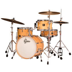
gretsch-catalina-club-in-natural

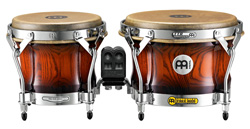
Well that works great for square images and images that are taller than they are wide, but what about images that are short and wide? You can make it work with these images by setting the image to grow by its width rather than its height, and setting the initial margin on the left and right. This will cause the image to grow downwards from its initial position, but setting an initial margin-top and margin-bottom equal to half the number of pixels the image grows vertically by will keep it vertically centered. For this image that is 250px wide by 129px tall, the magic margin number is 5px:

.wrapper {
  width: 250px;
  height: 129px;
  text-align: center;
}

.wrapper img {
  margin: 5px 4%;
  width: 92%;
  height: auto;
}

.wrapper img:hover {
  margin: 0;
  width: 100%;
}

The result:

meinl-bongos

If you want to get real fancy, you can add a transition animation. If you add one on hover, make sure to add one on the way out for ultimate smoothness:

.wrapper {
  width: 250px;
  height: 250px;
  text-align: center;
}

.wrapper img {
  margin: 4% 0;
  height: 92%;
  width: auto;
  -webkit-transition: margin 0.3s, height 0.3s;
  -moz-transition: margin 0.3s, height 0.3s;
  -o-transition: margin 0.3s, height 0.3s;
  transition: margin 0.3s, height 0.3s;
}

.wrapper img:hover {
  margin: 0;
  height: 100%;
  -webkit-transition: margin 0.3s, height 0.3s;
  -moz-transition: margin 0.3s, height 0.3s;
  -o-transition: margin 0.3s, height 0.3s;
  transition: margin 0.3s, height 0.3s;
}
The result:
gretsch-catalina-club-in-natural

Once you start playing with transition timing functions and delays you can do some very cool effects, and if you bring in some box-shadow and filters the possibilities become endless.

This could also be wrapped up in some jQuery for added flexibility. There are a couple of extra things to think about, like whether you have any padding or margin already set on certain images that might be critical to the layout, but here is a quick example that will target all images that are links and doesn't require any markup changes:

// Start on window load because we need images to be loaded 
$( window ).load( function(){

   // Loop through each image that is a link
   $( 'a img' ).each( function(){

      // Store the current item
      var $this = $( this );

      // Wrap the image link in a div
      $this.parent().wrap( '<div class="img-link-wrapper" style="display: inline-block; text-align: center;"></div>' );

      // Set the height of the div to the height of the image
      var imgHeight = $this.height();
      var imgWidth = $this.width();
      $this.parents( 'div.img-link-wrapper' )
           .css({ 'height' : imgHeight,
                  'width' : imgWidth     
                });

      // Set the rest of the initial css
      $this.css({ 'height' : '94%',
                  'width' : 'auto',
                  'margin' : '3% 0'
                });
   });

   // Set up a .hovered class
   $( 'body' ).append( '<style>img.img-link-hovered{ margin-top: 0 !important; margin-bottom: 0 !important; height: 100% !important; }</style>' );

   // Add/remove the class on hover
   $( 'a img' ).hover(
      function() {
         $( this ).addClass( 'img-link-hovered' );
      }, function() {
         $( this ).removeClass( 'img-link-hovered' );
      }
   );
});

See the Pen Hover enlarge on images that are links by Braad Martin (@BraadMartin) on CodePen.0

What fun!

-Braad